Magic the Gathering has amazingly pretty realism, and Pokémon has adorable cutesy artwork, but Yu-Gi-Oh hits it just right with a blend between cartoony silliness, epic fantasy, and awesome sci-fi. There’s really no game like it! This list will break down some of the best pieces of card artwork in the entire Yu-Gi-Oh TCG. Note that this list is entirely subjective, and there will definitely be cool pieces of artwork I’ve missed! This is more about the iconic pieces of art throughout Yu-Gi-Oh’s history, and celebrating a few of the lesser known cards as well. So let’s look at some pictures!
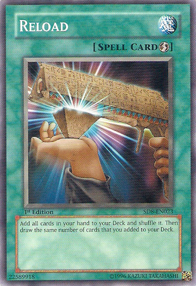
20. Reload
With decks based around Star Wars (Kozmo), Circus Animals (Performapals), and Dante’s Inferno (Burning Abyss), it’s sometimes easy to forget that Yu-Gi-Oh was originally based on ancient Egypt. Reload is one of those cards that reminds you of that theme, with some really clever artwork. It shows a gun being reloaded, all re-done in the style of Ancient Egyptian Monoliths. Personally, I just love how much personality this card artwork has. And it really takes me back to the old school days of Yu-Gi-Oh!
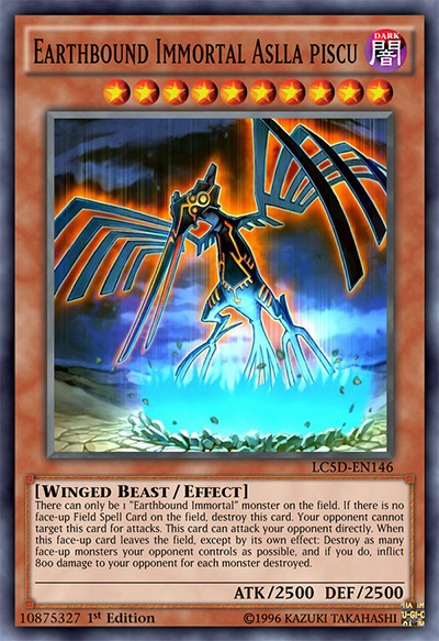
19. Earthbound Immortal Aslla Piscu
This one is more of a representative of the archetype as a whole. Earthbound Immortals have one of the coolest themes for an archetype I’ve ever seen. They’re all inspired by the Nazca lines in Peru, with Aslla Piscu representing the iconic hummingbird, Earthbound Immortal Uru being the spider, and so on. It’s really awesome to see cultures around the world being represented in my favorite card game, especially when that’s in the form of badass looking semi-evil God cards! Seriously, these monsters look intimidating as hell. And that’s what makes these card arts so great.
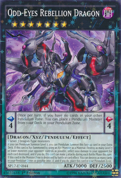
18. Odd-Eyes Rebellion Dragon
Odd-Eyes Rebellion Dragon is the perfect representation of a fusion between Odd-Eyes Pendulum Dragon and Dark Rebellion XYZ Dragon. It’s got features from both that just screams this card is a mix of two monsters, and it looks absolutely fantastic. This card was summoned in the anime when Yuya and Yuto came together as one, unleashing their anger on the people destroying their world. Odd-Eyes Rebellion Dragon looks like a dragon with power and anger behind it – perfectly representing the entire theme of the card.
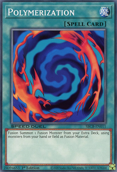
17. Polymerization (Original Art)
Polymerization is just an iconic card. People who aren’t really involved in Yu-Gi-Oh will probably remember this card from their childhood days! The card art is beautiful in its simplicity. It shows two generic monster-looking creatures being swirled into one, exactly how it looks in the anime. I think it’s also awesome to see cards you own as they are in the show. It really makes the cards you have feel magical in a way, which is why Polymerization is so iconic to me.
16. Ancient Pixie Dragon
I absolutely love this entire re-doing of the signer dragons. This card was Luna’s signer dragon in the Manga, having a slightly different effect and artwork to the cards shown in the anime. The artwork for this card is very similar to the original Ancient Fairy Dragon with a much darker color scheme. I personally think this darker scheme makes this monster look way more intimidating and powerful, especially in its original gold secret rare printing. The original artwork is also absolutely stunning, but I just love the darker aura this card art gives off.
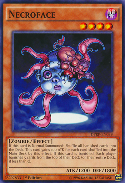
15. Necroface
What I love Necroface is how it’s completely different from most other Yu-Gi-Oh cards. Yu-Gi-Oh cards don’t tend to get what I’d call “creepy to the point of nightmare inducing” artwork. Seriously, this card creeped me the hell out as a kid… It’s literally a doll head filled with tentacles! Yet it’s really awesome to see artwork that’s different from the mainstream in Yu-Gi-Oh, and Necroface is a prime example of that. It really portrayed that horror movie vibe the card was going for. And to me it’s the perfect zombie artwork.
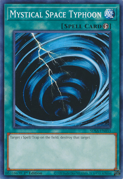
14. Mystical Space Typhoon
MST is another card that’s simply stunning due to how simple it is. Mystical Space Typhoon looks like a storm. That’s all there is to it! The way you can see the brush strokes swirling around the storm, with the simple crack of lightning going down the middle, it really gives me early Magic the Gathering vibes. This card is also really fun to extend the art on, and I personally have a couple of hand-made extended art editions for a couple of decks!
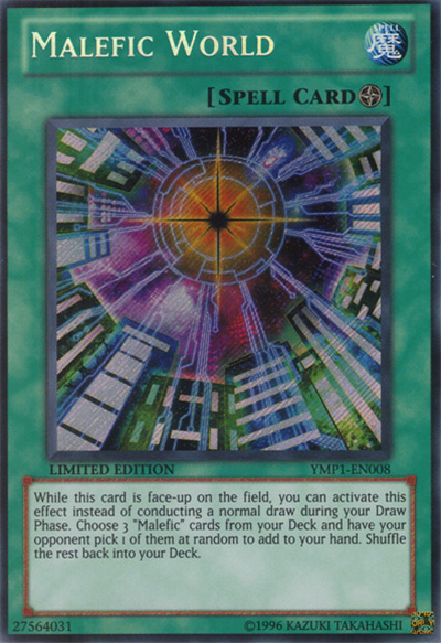
13. Malefic World
I really hope Konami makes the decision to reprint all of the Malefic cards at some point, as these cards are too pretty to keep in the hands of collectors who bought these cards years ago. Malefics were released as promotional cards for the Yu-Gi-Oh: Bonds Beyond Time movie. They’re an archetype of monsters that are essentially “stolen” monsters throughout Yu-Gi-Oh’s history. Malefic world is pretty much a scene taken directly from the movie, where the main villain shows what a Malefic world would look like. It’s in this Malefic world that our protagonists Yugi, Jaden, and Yusei take down the main villain, which is what makes this card so awesome. It really makes you feel like a real-life Yu-Gi-Oh protagonist.
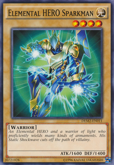
12. Elemental HERO Sparkman
Speaking of Jaden Yuki, the Elemental HEROs were one of the best bits of Yu-Gi-Oh GX for me. They were a series of superheroes who channeled the powers of the elements, with a whole bunch of powerful fusion monsters by combining their powers! If I had to choose a best artwork among them, it would have to be Elemental HERO Sparkman. He looks like a power ranger, with an emphasis on the power. The artwork on this card really channels that superhero look that this deck strives for, especially with the awesome blue and yellow theme of his armor.
11. Noble Arms – Gallatin
If you want an entire archetype with each card as stunning as the last, then look no further than the Noble Knights. These are a set of cards inspired by the old English tales of the Knights of the Round Table. As someone who actually lives in England, it was amazing to see stories I’d heard as a kid actually present in one of my favorite games! Noble Arms – Gallatin represents the story of King Arthur, who became the King by pulling a sword that has become impossibly stuck in stone. This style of the artwork really plays to the classic fairy tale theme of the Knights of the Round Table, as do the rest of the cards in the Noble Knights series. These artworks look especially fantastic in the exclusive rarity saved for the Noble Knight decks – platinum rare. This rarity gives all of the cards a beautiful dark tone and brings out the silvery colors in their swords like you wouldn’t believe!
10. Exodia Necross
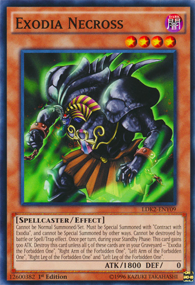
As a Yu-Gi-Oh player, it’s practically a given that I think Exodia looks awesome. I mean, he’s a sealed away God that’s just too powerful to be contained on one card. Exodia Necross embodies all of that on one single card. The broken chains around his wrists give that feeling that a great and terrible power has been unleashed, while the glowing red eyes and murky green aura give this feeling that Exodia is some kind of undead creature. Overall I just love how this card took Exodia in a different direction. And I’d almost be tempted to say it looks nicer than the original!
9. Soul Pendulum
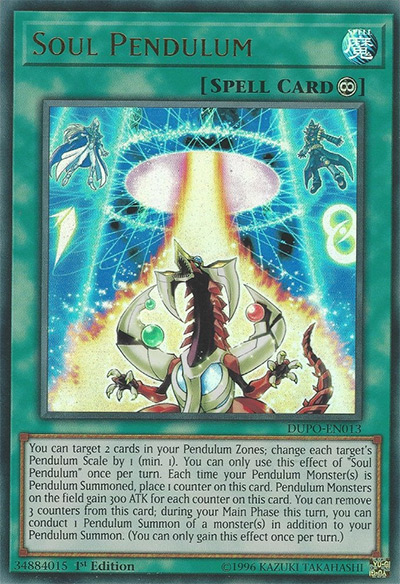
Yu-Gi-Oh Arc V was one of my favorite animes of all time. With exception to the ending, it was absolutely phenomenal! And Soul Pendulum encapsulates one of the best moments of the series: When Yuya pendulum summons Odd-Eyes Pendulum Dragon with his two signature pendulum monsters Timegazer Magician and Stargazer Magician. The art in this card is almost a direct rip from the show of just that, and it looks fantastic. It shows the two pendulum scales up high in their pendulum zones, with that magical looking portal to bring forth the pendulum monsters. It really makes you feel like your own pendulum summons are an almost magical occasion – and that’s how you know a card has really aced the artwork.
8. Dragon Ravine
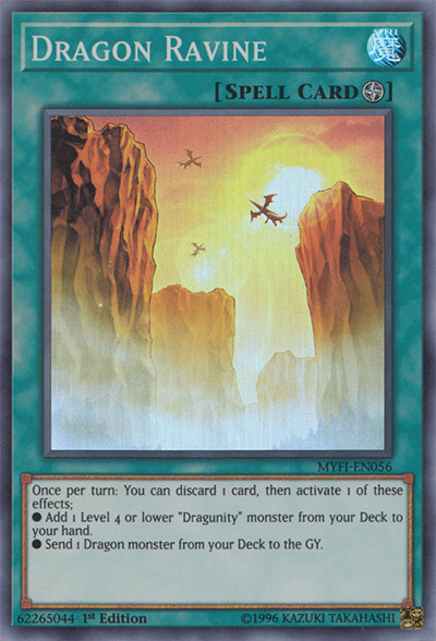
The original purpose of field spells was to change where it was you were battling. In the anime, this turned the duel field into an ocean, a mountain, or possibly even the shadow realm. Dragon Ravine truly looks like a place you would want to duel. You can see these dragons flying high above and circling, all while the sunset glows a burning orange down the middle of the ravine. It looks like something described in a fantasy nove. This card is an amazing landscape piece, and I for one certainly wish Kaiba Corp would invent duel disks in real life already so I could actually duel there.
7. Graff, Malebranche of the Burning Abyss
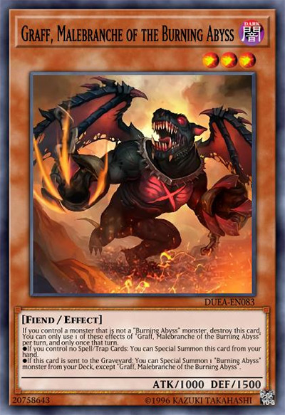
The Burning Abyss archetype is based around the epic poem Dante’s Inferno (and I don’t mean epic in the “cool” way), a poem about Dante’s journey through hell itself. It’s only natural that cards based around this archetype would have some awesome looking demons, and Graff is just that! Graff and the rest of the Burning Abyss demons look so realistic and frightening in their artworks, these cards definitely feel more like Magic the Gathering style artworks than they do Yu-Gi-Oh cards! I love the dark red and black color theme all of these cards have, as it really plays to the vibe of a creature literally from Hell itself.
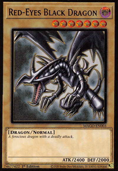
6. Red-Eyes Black Dragon (Original Art, LOB)
Unlike other classic cards such as Dark Magician and Blue Eyes White Dragon, Red Eyes really hasn’t seen that many alternate art reprints. There have been a couple of remasters of this artwork – but personally I think if it isn’t broken, don’t fix it. The original artwork is by far the best one, as it actually makes Red Eyes Black Dragon look intimidating. The background is also nice and simple, bringing all of the attention onto the awesome dragon you see before you. This is also the artwork used by Joey Wheeler in the anime. And so I think for a lot of us, this card is simply the best artwork for nostalgic reasons alone.
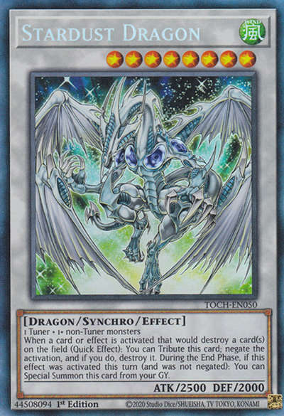
5. Stardust Dragon (Original Art)
Controversial opinion here, but this is the only main character card I actually love the artwork for. The rest of the main characters just got kind of okay looking cards (sorry Dark Magician), but Stardust Dragon truly looks like a mythical beast. The green and blue starlight twinkling behind it look magical, making this dragon feel like a blend between an epic fantasy dragon and a creature from space. This looks even better in the secret rare printing done for the 2008 card tins, where the shiny secret rare effect really amps up that star effect.
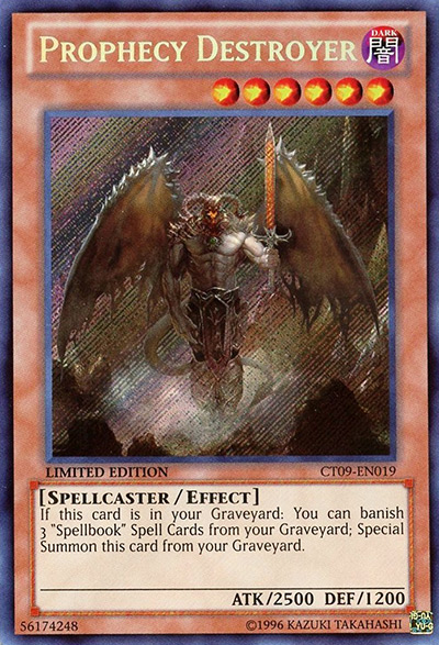
4. Prophecy Destroyer
Now this is a card that looks straight up like something from a different game entirely! It’s a whole new style compared to the rest of the Spellbook cards, and it looks stunning. The level of detail in this card’s artwork is insane – a lot of Yu-Gi-Oh art is characterized by the thick outlines and simpler looks, whereas this card is just jam-packed full of little details. The spikes on his wings, the clouds of mist and dust around his feet, the twists in his devilish horns, whoever drew this artwork truly when above and beyond the Yu-Gi-Oh standard.
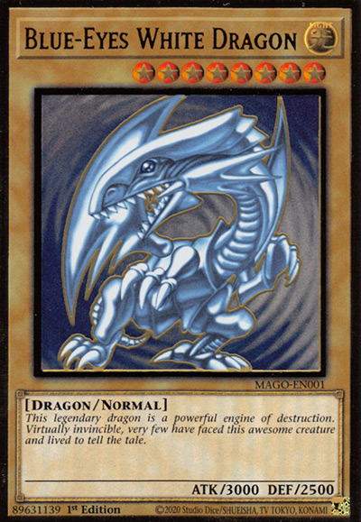
3. Blue-Eyes White Dragon (Original Art, LOB)
Blue-Eyes White Dragon is a card more famous that Yu-Gi-Oh itself. It’s one of the most iconic cards in all of trading card history. And so it makes sense that the original art is one of the best! The simple blue swirls in the background alongside the softer looking Blue Eyes White Dragon in front is somehow so simple and so elegant. This was also the artwork used by Seto Kaiba in the anime, when he was talking about how this card is the “rarest and most powerful card in the world”, and so this artwork really has a feel of power and rarity behind it. There’s been a lot of alternate arts for this card, more than I’d care to list. Yet this original art is easily the best one out of them all. Whenever I’m building a Blue Eyes deck, it’s this art I make sure to scout out.
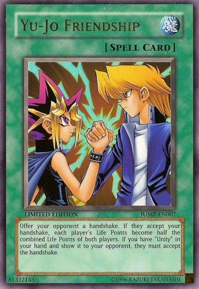
2. Yu-Jo Friendship
It’s very rare for the trading card game to mention the anime or manga. But here we are. This was a Shonen-Jump promotional card, which released along two other cards: Unity and Judgement of the Pharoah. The Yu-Jo Friendship card in particular features Yami Yugi and Joey Wheeler shaking hands after a duel. Yugi and Joey had one of the best friendships in anime as a whole, let alone in Yu-Gi-Oh, and so this artwork really has a nice sense of warmth and love to it. It reminds me of (to be cheesy for a second) the power of friendship, and what we can all accomplish when we help each other towards our goals. More importantly, it reminds me that I definitely need to rewatch the original series of Yu-Gi-Oh!
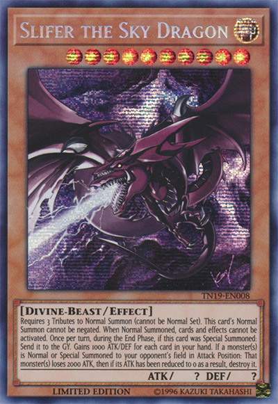
1. Slifer the Sky Dragon (TN19 Art)
This artwork of Slifer the Sky Dragon was drawn by none other than the one and only Kazuki Takahashi! If that name’s not ringing any bells for you, maybe check the bottom of your Yu-Gi-Oh cards. Kazuki Takahashi was the original manga artist and creator of the Yu-Gi-Oh series, the man we have to thank for Yu-Gi-Oh itself. Takahashi has illustrated a select few of the original Yu-Gi-Oh cards, most notably all of the Egyptian God cards. These cards have the most beautiful art in the entire game – and I’d give all 3 the top spot if I could! All of these artworks really make the God cards feel like, well, Gods! They look so powerful and ancient in these drawings, that they really don’t look like a force to be reckoned with. The dark and shadowy colors in this particular art for Slifer give the impression that you’ve awakened an ancient and mythical force. And if that doesn’t make you feel like a Yu-Gi-Oh protagonist, I don’t know what will.
