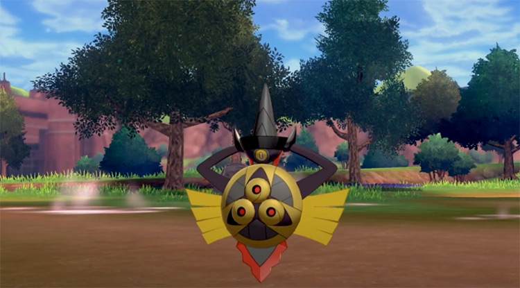
However, there’s a handful of Pokémon that aren’t just great-looking grey shinies, but they’re also among the best-looking shinies period. I’ll admit: the reason for that might be because there are some similarities between black shinies and grey shinies. So take a peek at our list of darker-colored black shinies if you want even more ideas. Now you might think some of the Pokémon in this list aren’t totally grey. And not only do I disagree with that, but I say they’re not quite grey enough! So let’s just dive in and see what we’ve got.
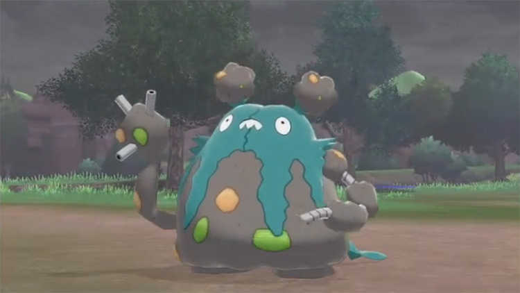
15. Garbodor
I’m not gonna lie, this is a Pokémon that I wish I could sort of forget about. It’s the one that everyone points to when they’re talking about how bad the Dex is in Gen V, and understandably so. That being said, there’s a distinct lack of decent grey shiny Pokémon out there. So I, reluctantly, have to give shiny Garbodor a spot. The obvious change between the normal color scheme & the shiny version is the fact that its trash bag head is blue instead of green now. All that tells me is that it’s less environmentally friendly. Its body becomes grey instead of, well, whatever it was before. So it gets a spot on a technicality.
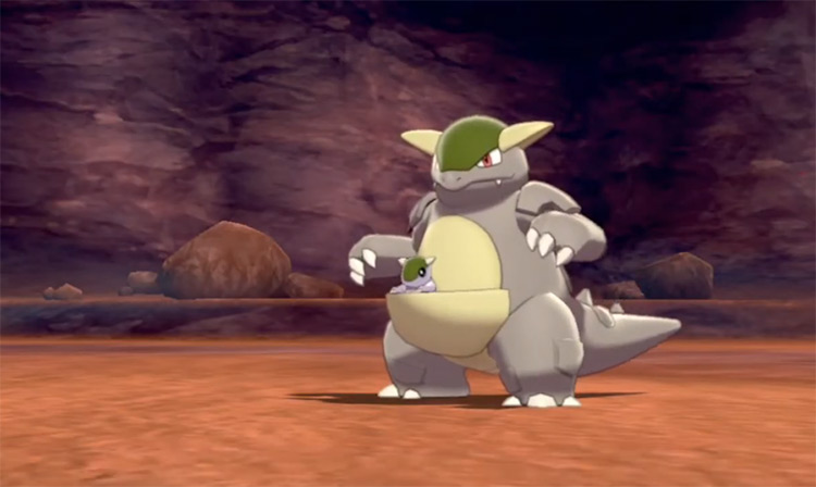
14. Kangaskhan
Does anyone want to get a bet going on when Game Freak is finally going to give us some more intel on Kangaskhan? I mean, it’s been around since Gen I. And we still don’t know what’s going on with that baby. Is it a Cubone? A pre-evolution? Nobody knows. What I do know, though, is that shiny Kangaskhan is grey. Yeah, that’s all I’ve really got here. It’s just grey instead of brown. But hey, at least it’s not a sentient pile of literal garbage.
13. Magneton
Oh man, what is it with all the boring grey shiny Pokémon? It’s a bit of a stretch, even calling shiny Magneton grey. It’s more of a washed-out brown, but I think I can justify its place here. Generally it’s kind of a completely uneventful sprite, I’ll admit. But trust me when I say it’s better than a lot of the alternatives I had to wade through to organize this list for you.
12. Magnezone
Magnezone is grey, just like its pre-evolution. And rather than browning, though, it verges closer towards being white. It also gets a cool new blue nose, so that’s neat. I guess. Thankfully, the sprites get a lot more interesting from here on out, so thanks for sticking with me through these first few… let’s say uninspired designs.
11. Accelgor
The first Pokémon TCG tournament I ever won was because I beat a Trevenant and Accelgor deck in the finals. So I’ll admit that I have a bit of a soft spot for the Pokémon. That being said, the shiny sprite is still well worthy of a place here, even without my personal bias. Especially when you compare it to the previous entries. Accelgor is meant to be a ninja, so the change from blue to a dark grey works really well. What I particularly like about the sprite, though, is that its head piece becomes golden instead of that peachy color. This makes Accelgor look like a ninja potato to me. And as an Irishman, I find that pretty damn amusing.
10. Slugma
Magcargo doesn’t follow the same shiny color palette as Slugma, and that’s a shame. While the purple alternative is cool and all, there’s something disgusting about the grey blob of sludge that is shiny Slugma. It looks like what you’d cough up after you’ve been smoking a pack a day for a few years. Whether that’s a good thing or not, I’ll leave up to you to decide. But I like the idea of using a Pokémon like that.
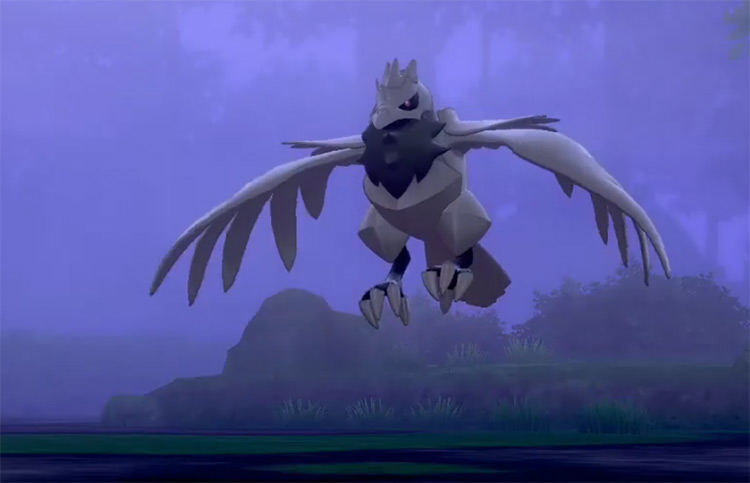
9. Corviknight
At this point, there’s a significant spike in the quality of the sprites. This should be evident given that I’m only putting Corviknight at this point in the list, despite it being one of the better-looking shinies to come out of Gen VIII. The shift to a light grey color here, I think, suits the theme that Corviknight is designed around. While the original dark blue/black might look menacing, the grey makes it look like a genuine knight that’s clad in steel armor. It’s one of those shinies that you actively pursue once you see it. Speaking of which, I might start hunting for one myself as soon as I finish this list.
8. Cofagrigus
Until doing research for this list, I had never actually seen a shiny Cofagrigus. Nor had I ever heard anyone talking about it. I don’t know why either, because it actually looks really cool. While I’ll admit that the Pokémon’s regular colors work much better as a sarcophagus, the purple and grey change is just stupendous. There’s no logic behind it, as far as I can tell. But there doesn’t have to be for a shiny Pokémon to capture an aesthetic. It only has to look awesome, and shiny Cofagrigus does.
7. Metagross
I have a love/hate relationship with the Beldum evolution line. On the one hand, I tend to use a Metagross on my team in whatever generation it’s available. On the other hand, it typically takes me hours to actually catch one in the first place. So if you plan on hunting for a shiny Metagross (which you really should), please do the Masuda method. You’re only torturing yourself if you try to hunt for it any other way. Looking at its design, I’m sure I don’t need to justify why I’ve given it the number seven spot. It isn’t the best-looking grey shiny, but you have to admit that it still looks phenomenal. The silver body works with the gold to make the sprite look truly rare, compared to looking like a Pokémon that just jumped into a vat of paint.
6. Mimikyu
Speaking of jumping into a vat of paint, I’m immediately going to make a hypocrite of myself by saying Mimikyu, despite having that one color shiny change, is one of the best ideas for a sprite ever conceived. It just goes from yellow to grey. But when you think about the kind of Pokémon that Mimikyu is (and I don’t just mean typing), this color change makes perfect sense. Mimikyu is just a sad and lonely guy. It’s the manifestation of depression if it was a Pokémon. So the total grey conversion is a fitting change, albeit one that seems a little bit tragic.
5. Ninetails
Ninetails is a sleeper-hit favorite of mine. It’s the kind of Gen I Mon’ that doesn’t get too much love, but almost anyone can appreciate just how well designed it is. It’s clean, pretty, and has held up remarkably well over the last few generations. It’s held up so well that I’m arguing its shiny is still one of the best ever made to this day. It gets a total color change from cream color scheme, to a very mystical grey with blue tail-tips. It fits the Kitsune theme perfectly and looks the part quite well.
4. Ho-Oh
Shiny Ho-oh looks like a turkey. I’ve typed that so many times, but it never gets old. I mean, it looks great. The silver tail feathers with the beak make it look far more mythical than the red and yellow alternative. But this shiny color change also makes it look like it belongs on my plate at Christmas. Again, that isn’t exactly a bad thing. But it might put some of you off the design. For anyone cultured enough to appreciate when Pokémon designs are silly like that, you get where I’m coming from.
3. Haxorus
Is shiny Haxorus black? Maybe, but I’m not wearing my glasses, so I don’t care (yes I use that excuse a lot). We can argue about the color all day, but there’s no denying how unbelievably awesome shiny Haxorus looks. Even Game Freak knew they did a good job with the design, given they made it a goddamn event Pokémon. Not only does the grey armor-like body look menacing, but I swear to god the red on its tusks is meant to be Jigglypuff blood or something.
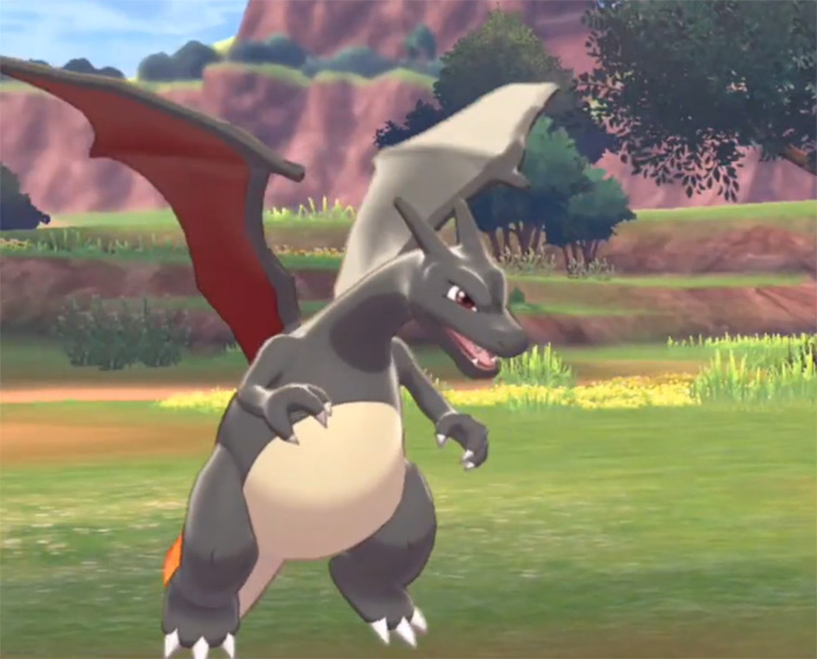
2. Charizard
Okay, I can justify arguing for Haxorus being grey, but Charizard might be a bit of a stretch. That being said, it was noticeably greyer before Gen VI, so that’s the angle I’m working with here. You don’t need me to tell you why shiny Charizard looks so cool. Because you’ve already heard it all before. Anywhere that the best-looking shiny Pokémon are being talked about, Charizard is always in the conversation. It’s a grey/black and red dragon. A color combination that works so well for a good reason (see Haxorus).
1. Aegislash
Aegislash is another arguably black shiny instead of grey, but it really does look grey in most games. And it also happens to be my favorite shiny Pokémon of all time, so let me have this one. It’s got that blood-inspired red accent on the blade-like Haxorus. But unlike Haxorus, it actually has a bit of contrast in its body. It’s meant to be a regal sword and shield (unrelated to the actual Sw/Sh games). And nothing looks more regal than gold and grey. I’ve said it before, but this is the type of Pokémon you would see on the wall of a throne room. I’ll admit that there is some moral ambiguity with that idea. But it’s so good-looking that I’m willing to turn a blind eye to those kinds of questionable ethics.
