Expanding this metaphor to anime, we have character design. So what are some anime characters that really just pop off the screen and leave a lasting impression? Well here are some of our absolute top picks, and you can be the judge!
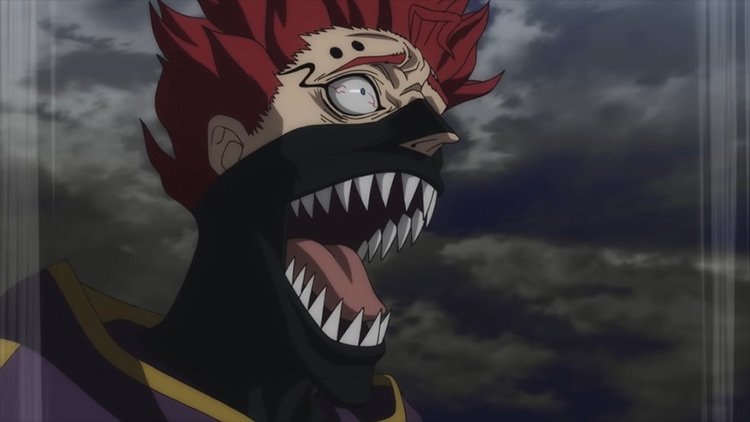
20. Zora Ideale
Anime: Black Clover Starting off we have some edge praise. Now there’s no denying that Zora instantly caught my attention, as he looks like a villain/edgy hero hybrid… and thus my theorizing brain went wild. With his spiky red hair, cunning eyes, and shark-like teeth, he definitely looks like a threat. On top of that, his wardrobe choice makes him look like a trained assassin. And when the character himself is considered, I find this design to be a fitting choice. He looks menacing, but would lose if he ever got jumped. Like a king cobra or something.
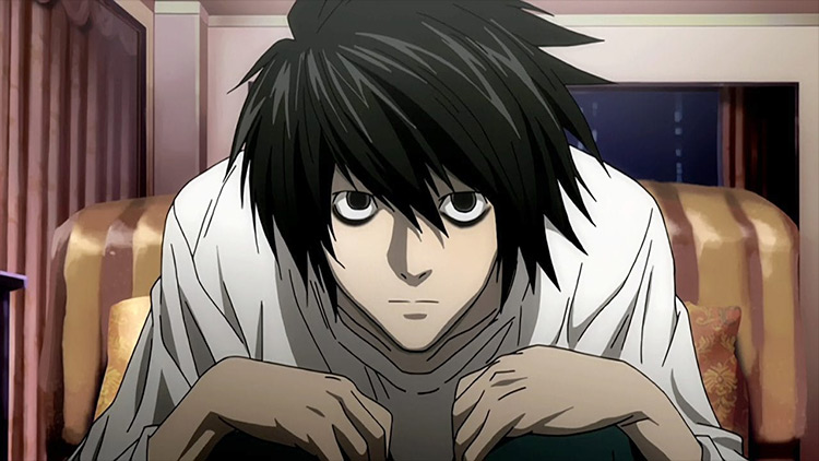
19. L
Anime: Death Note The fact that a regular human character is as recognizable as L really speaks volumes about his design. His unkempt hair and tired eyes just give off the vibe that everything outside of his interests is foreign and irrelevant. Further praise needs to be given for his mannerisms. Because the way this man sits is so distinguishable. His tone, posture, choice of words, they all allude to a genius who lives entirely within the confines of his own mind.
18. Hisoka Morow
Anime: Hunter x Hunter (2011) I’m not sure how the design team landed on a clown concept. But I’m so glad that they did. Firstly, this ties in so well with his nen ability, Bungee gum, which as we all know has the properties of both rubber and gum. It sounds so unassuming and precious. And yet he keeps murdering people with it. That brings me to my second point: it just fits perfectly for Hisoka to be a clown, as he can look and act so goofy and innocent in one second, then transition to the 2016 clown murder scare in the next. So even though he’s the only one laughing, he makes for the perfect clown character design.
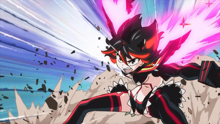
17. Ryuuko Matoi
Anime: Kill la Kill As a straight man, I love two things: parody, and I can’t talk about the other one. But Ryuuko sums up both perfectly. The fact that in her “base form” she looks like such a rebel, someone who would definitely be one of the boys, contrasts her… “battle-ready” mode so heavily. When she dawns Senketsu, she’s as skimpy as television will allow. It was like the weirdest middle finger from Studio Trigger to censorship by making this warrior have iron protection strictly around her shoulders and hands. The exposed middle part is not a design flaw, I swear. Body positivity or knowing your market, you decide.
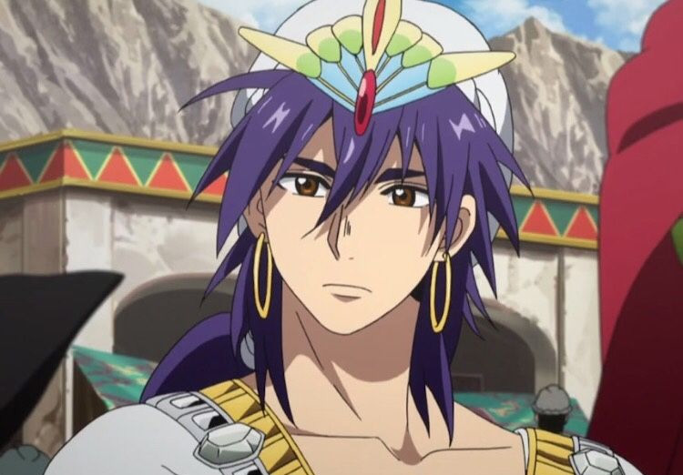
16. Sinbad
Anime: Magi: The Labyrinth of Magic I honestly love most of the design choices that went into Magi. The whole India/Arab (I really don’t know, please don’t kill me) style of their outfits is just top-notch. And Sinbad just takes the cake in that regard. Having this muscular, tall, absolute Chad of a man decked out in jewels of varying shapes and sizes really sets him apart. You could tell that he was the big man at a single glance. I would also add bonus points for how he was depicted in the prequel. It’s obvious just how much power these jewels possess, both lore-wise and aesthetically.
15. Nagato
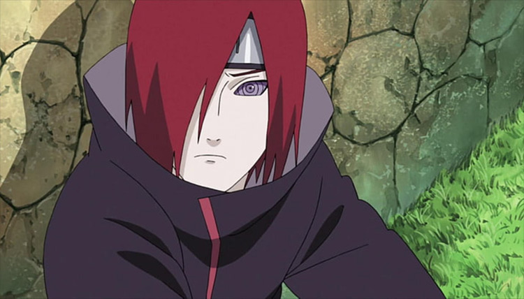
Anime: Naruto: Shippuden The Akatsuki look badass from the start. There’s just something about their cloaks that oozes hype. But Nagato, or should I say the six paths of pain, was definitely my favorite design-wise. Having them all look so similar, with the same cloak, hair color, and the same eyes, and yet so different in body proportions, hairstyles and facial features. It makes them look so cool. When you add the fact that we had not seen the Rinnegan before and that his piercings kicked ass, you get an amazing character.
14. King
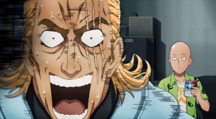
Anime: One Punch Man It’s no surprise that a lot of One Punch Man characters are designed to be parodies of superhero tropes, most obviously Saitama. But I found King to be a lot more interesting. His design is literally his power. By having a jawline that can shred cheese, the typical nasty scar across the eye, and having the demeanor of a tired but trained veteran, King is quite intimidating. But of course, when you pull back the covers you see a weeping scaredy-cat who’s only powerful in the virtual world.
13. Ougi Oshino
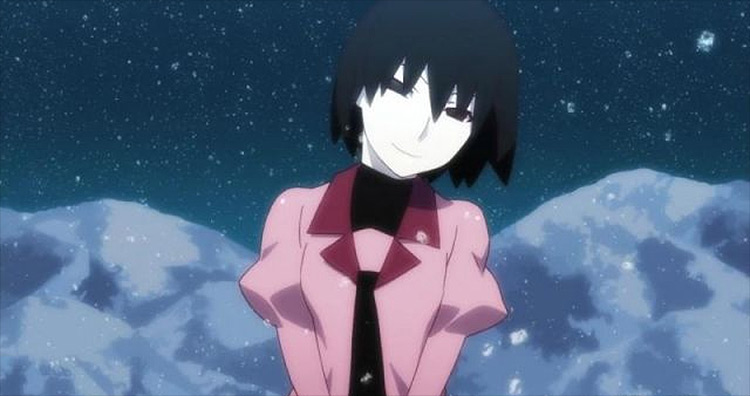
Anime: Owarimonogatari It never mattered what Ougi would do or say. I didn’t trust her. Just the way her face was drawn always kept me on edge. She always seemed like she was scheming something… like every word was a poisonous dart director at the main cast. Even when she would dance around and act all cheerful, this feeling never left me. And if you can elicit that type of response regardless of what the character is doing, you know the design is on point.
12. Petelgeuse Romanée-Conti
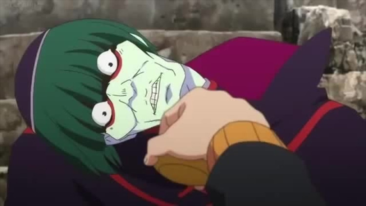
Anime: Re: Zero Kind of an off-meta pick here, but hear me out. Was anyone, ever, in the history of anime, surprised that this man is not a good guy? His design just screams villain. To add to that, we even learn quite a bit about him through his appearance. His very bony face structure shows that he doesn’t take care of his body all that much. And the seven layers of bags under his eyes show that something is obviously keeping him up at night. His outfit just screams high rank and occult, backed up further by the obviously religious tones of his skullcap. And I mean, that’s pretty much what the character is. So good job White Fox.
11. Kamina
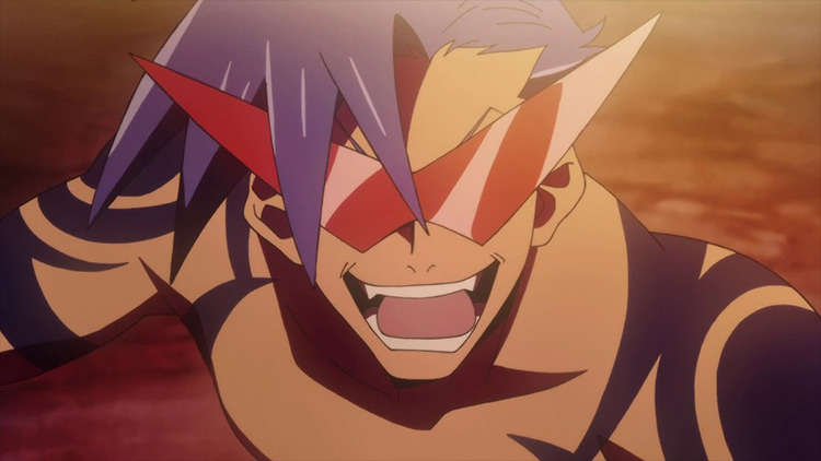
Anime: Tengen Toppa Gurren Lagann You take one look at Kamina and you already know he’s not the shy, introverted type. He’s as flashy as you can get, with bright color being dominant throughout his design as well as sharp angles. The ridiculous pointy glasses alone can symbolize Kamina as a character. Loud, in your face, noticeable, and most of all memorable. He wasn’t designed as the most powerful man alive. But rather like the mouthpiece of the show, like the shiny beacon of hope everyone looked up to. And so he was. Ten points also added because he has a katana, those are the rules. Also, who’s counting points for this list?
10. Ken Kaneki
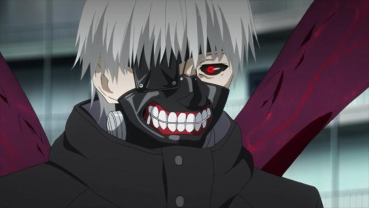
Anime: Tokyo Ghoul Say what you will about the show (especially the later seasons) but the character design was on point. Characters like Juuzou or Uta could have also easily made the list, had I not chosen to limit the number of characters per season/per show. Firstly, the choices for Kaneki’s hair basically tell a big chunk of the story. As they show which mental state (or personality to be more precise) he’s in. His mask also did wonders in terms of storytelling. The covered eye alludes to his past human self, and the mouthpiece perfectly illustrated how he was willing to show off his fangs, but not actually bite.
9. Taiga Aisaka
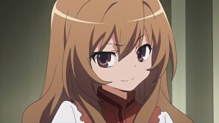
Anime: Toradora! It’s not easy to make a distinguishable character in a slice of life show. And yet Toradora pulled it off… well at least with Taiga. This was because again, it did most of the storytelling. By making Taiga so small in stature we’re led to believe that she’s helpless and vulnerable. But drawing her face in a more serious tone helps us break away from that delusion. She’s far from all mighty and does need help quite frequently. But she’s far from weak. It’s the combination of these two artistic choices that make her the tsundere queen, whose mere silhouette is recognizable at a glance.
8. Joutarou Kuujou
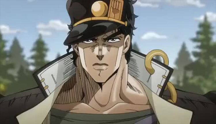
Anime: JoJo’s Bizarre Adventure: Stardust Crusaders I hope we can all agree that Joutarou was the best JoJo, right? I mean just look at the guy! From his massive height, wide chest, glaring eyes, we already knew we had a bad-boy on our hands. His signature flowing cloak, that’s actually part of a school uniform, signals that he’s still rather young. But his accessories, most notably the chain, definitely make us lean towards the delinquent side of things. He looks like a well put together, rugged, rebellious guy. And that sums him up pretty nicely.
7. Tomura Shigaraki
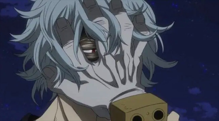
Anime: Boku no Hero Academia It doesn’t take a detective to realize that there’s one aspect of Shigaraki’s design that’s rather uncommon, it being the severed hands all over his head and body. At first I thought it was just a throwaway detail meant to give him a more menacing vibe. But as we later learned from the manga, they actually hold significant narrative importance. I don’t want to spoil that part for you anime-only watchers. But let’s just say that it gives the character a lot of depth and sheds a new light on his evil ways.
6. Legoshi
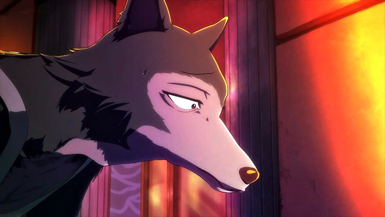
Anime: Beastars I know Legoshi might not seem all that creative. He’s just your average wolf boy. However, the design team still did a banger job with him because he looks just the way his character feels. Firstly, even the choice of animal was splendid since the show revolves around the fear he instills in others. But then you look at his timid eyes, his bent-over posture, unassuming uniform, and you come to find that he is far from vicious… in fact, he’s ashamed of his predatory nature. Just seeing him walk speaks volumes about his mental state. And I think that kind of character design gets overlooked way too often.
5. Muzan Kibutsuji
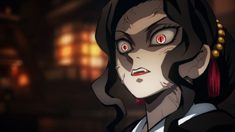
Anime: Demon Slayer I love me a good bad guy. Especially when the design team keeps it simplistic, and yet so iconic. Muzan was the big baddy we’ve been told about. And when he was finally revealed I’m sure it caught some people off guard. The fact that he looked like this well put together man with his wife and child completely threw Tanjirou out of the loop. But it fits so perfectly. Because evil is not always some ten-story tall monster… sometimes he may just look like an outstanding citizen. Bonus points, of course, for looking like Michael Jackson.
4. Shigeo Kageyama
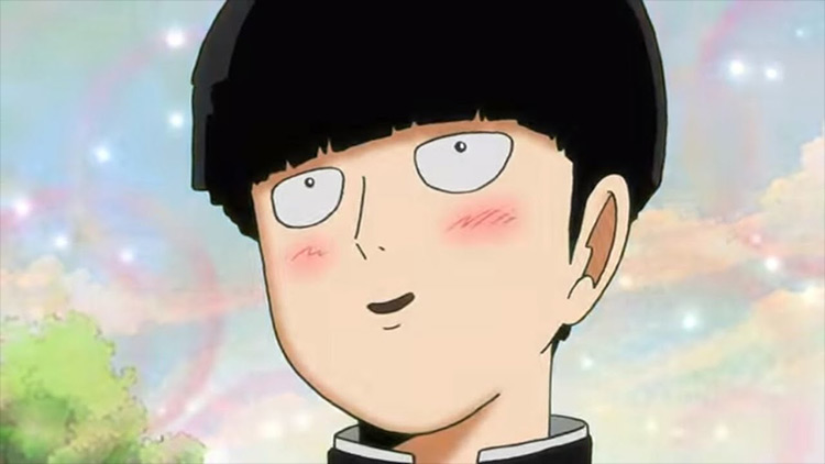
Anime: Mob Psycho 100 Two main reasons why I’m putting Mob on here. First, I appreciate that they made him look like a doofus because he is one. Not hating on the character, I love the little demi-god. But he is just a normal teen. An anxious, easily manipulated, curious, teen. So I’m glad he didn’t get the usual “two feet tall bad boy with rock hard abs at 14” look. Second, the way his rage is presented. It just gives the show so much hype. But also really showcases Mob’s own relationship to his powers and his feelings. It’s a floodgate.
3. The Saiyans
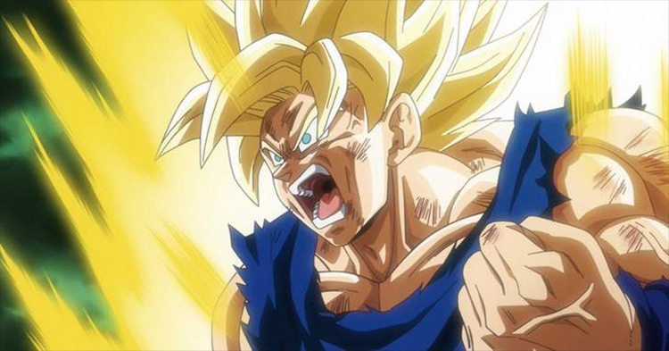
Anime: Dragon Ball Z Yes, I’m putting the entire race on here. That is because they have somehow managed to keep up with the times for literally decades. Your hair changing when you power up has become synonymous with “going super Saiyan”. And it’s recognizable to any anime watcher. Plus, the fact they’ve been able to pump out transformation after transformation and somehow keep the audience engaged is admirable at the very least. And I do think that comes from smart design. Never going too far and cliffing yourself, but always making it just different enough for the flow of the battle to change. And for millions of people to start screaming in excitement.
2. Escanor
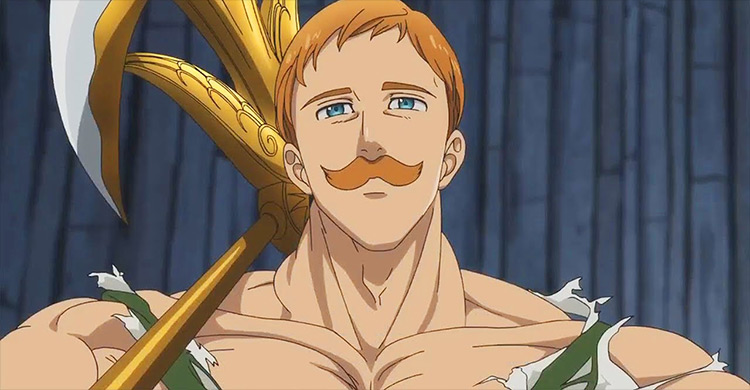
Anime: The Seven Deadly Sins I like Escanor’s design because I believed that his two forms were done extremely well. His “night form” looks like the nicest pushover. No one would ever assume any malintent from that guy. And you shouldn’t. While “day form” Escanor has such a cheerfully smug face that you think he pities God himself for having to create only one perfect being. And I’m pretty sure that is how he feels. We have seen many big muscular men and scrawny weaklings. But rarely do you see someone who dominates the scene during the day, nor hides in the shadows at night.
1. Koro-Sensei
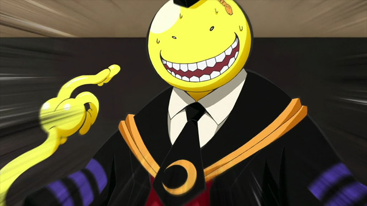
Anime: Assassination Classroom Again, might seem a bit off as he looks like a Pringle’s advertisement, but keep reading. Even with his simplistic goofy face, the show manages to portray every one of Koro-Sensei’s emotions so well. Be it by his face changing color, or turning into a spawn of Satan. And I think that isn’t very easy to do. Especially to the degree that truly envisions a yellow tentacle monster possessing such complex feelings. Maybe I’m biased because I love the character so damn much. But I couldn’t see the show being as real as it is without his design choice. Nor could I see someone else pull off this concept to such a degree.
